Get a calibrated and efficient model with tailored data augmentation.
Authors : Tristan Waddington, Fabien Lagnieu & Dimitri Henrard-Iratchet
Comment on the research paper: Tailoring Mixup to Data for Calibration, written by Quentin Bouniot, Pavlo Mozharovskyi & Florence d’Alché-Buc, from LTCI, Télécom Paris, Institut Polytechnique de Paris, France
Table of contents
- Existing Data Augmentation Methods
- Understanding Calibration
- Best of both worlds: Tailoring Mixup to Data for Calibration
Introduction
“But it works well on the training set!” is the machine learning equivalent to the classic “But it works on my computer!”
The basic workflow of machine learning has two steps:
- First, train your model to perform a task from an available dataset.
- Second, generalize and predict the results from unseen data.
How can data scientists be sure and confident that their model will infer a correct result on this new data?

We know that deep learning models need vast amounts of data to be efficient. So, when there is not enough, researchers simply… create more data: this is the concept of data augmentation.
However, this technique tends to exarcerbate the models’ overconfidence in their predictions. Discrepancies between confidence and prediction accuracy are acceptable in domains such as e-commerce recommendations, but high stake applications such as medical diagnosis or nuclear safety require an accurate confidence score, where robustness and reliability are critical.
This is the idea behind calibration: the model’s confidence in its prediction must truly reflect its own prediction accuracy. Well-calibrated models do not just inspire trust; they also contribute to fairer decision-making, by ensuring that predictions are accompanied by reliable confidence estimates, which can help reduce biased or unjust outcomes.
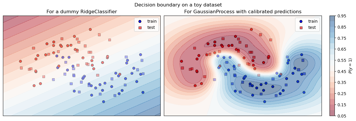
Figure: Illustration of the confidence of a calibrated classifier (right) with accurate prediction probabilities and a more brutal and under-confident one (left).
Merging data augmentation and calibration is challenging. The first is prone to create manifold intrusion, where synthetic data with a given label conflicts with original data of another class. The rise of the size of the dataset also increases the computational cost of the training. This contradicts the potential objective of frugality. The second is known to constrain the accuracy.
To handle these challenges, Quentin Bouniot and Pavlo Mozharovskyi have conducted under the direction of Florence d’Alché-Buc an extensive study on one of the technique of data augmentation, the linear interpolation of training samples, also called Mixup. They have found an efficient way to tune this process to both improve the performance and the calibration of models, while being much more efficient than previous methods.
Let’s dig step by step into it.
1. Existing Data Augmentation Methods
Deep learning methods rely on vast amounts of data, so if you do not have enough, make it yourself. This is the first conclusion of the study of a Microsoft Research team, lead by Patrice Simard in 2003 aimed to list the current best practices of neural networks training:
“The most important practice is getting a training set as large as possible: we expand the training set by adding a new form of distorted data.” [Simard et al. 2003] 1
The good results of subsequent models have proved them right. And numerous techniques have been developed since. Let’s review some of them.
1.1. Create new images for classification
The most visual example of data augmentation is the way image classifiers are trained. To make them more robust and efficient, scientists have transformed the input images to drastically increase the size of the training set (by up to 2048 times).
The most commonly used transformations
are random cropping and resizing, flipping, and color distortion.
This is now so common that it can be done in a few lines in pytorch (see next code
snippet), and automatic recipes
such as AutoAugment2 are readily available to augment common datasets.
from torchvision import transforms
# Definition of transformations for an image dataset
transformTrain = transforms.Compose([
         transforms.RandomResizedCrop(224),
         transforms.RandomHorizontalFlip(),
         transforms.ColorJitter(brightness=.5, hue=.3)
         ])
Additional transformations for images are illustrated on the next figure. We expect the neural networks to “see” these 10 new images as being close in their latent space. With this example, one original labeled image is processed 10 times in different versions during the training of the model.
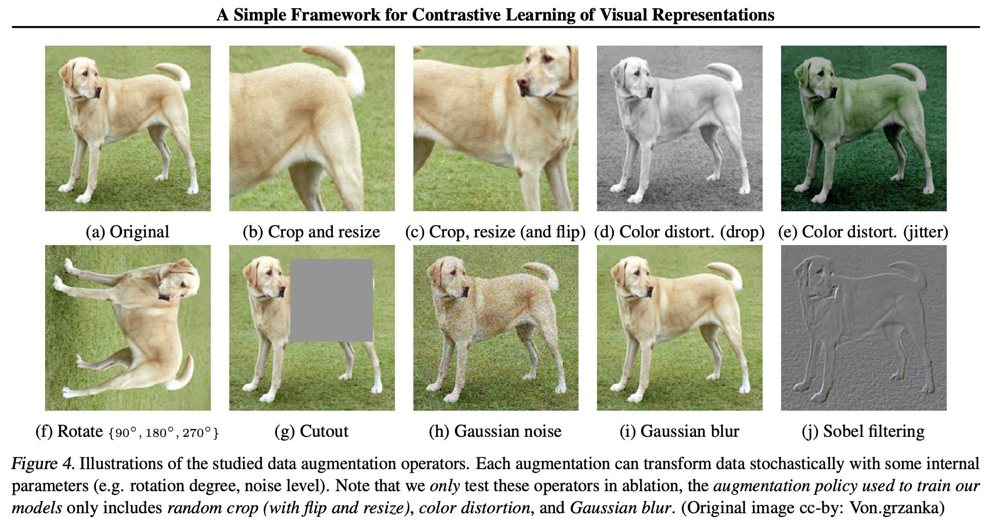
Figure: Illustration of different data augmentation operators, taken from the paper of Chen 2020 3
1.2. Linear interpolation or Mixup
Another idea is to create a virtual sample from a vicinity around the true training data—like we did in high school when we added epsilon to a number to see in witch direction the function is moving. This principle has been demonstrated to help models generalize. However, the method of creation is often hand-crafted and only mimic natural perturbations.
To scale up this process, [Zhang et al., 2018]4 imagined the Mixup process, which is a linear interpolation, or mixing, of two or more training datapoints.

Figure: Illustration of a linear interpolation of Mixup. New points $\tilde{\mathrm{x}}_1$ and $\tilde{\mathrm{x}}_2$ are respectively drawn from the segment $[\mathrm{x}_1, \mathrm{x}_2]$ and $[\mathrm{x}_1, \mathrm{x}_3]$
The process of data augmentation during training with Mixup consists of three phases:
- selecting tuples (most often pairs) of points to mix together,
- sampling coefficients that will govern the interpolation to generate synthetic points,
- applying a specific interpolation procedure between the points weighted by the coefficients sampled.
However, the literature explores the drawbacks of this process:
- Mixing carelessly different points can result in incorrect labels and hurt generalization [Guo et al., 2019]5, while mixing similar points helps in diversity [Dablain et al., 2022].
- Furthermore, several previous work have highlighted a trade-off between performance and calibration in Mixup [Wang et al., 2023].
Before digging further into the Mixup process, it is time to understand what exactly is the calibration of a model and why it can be worth of a trade-off with performance.
2. Understanding Calibration
Modern (post 2016) neural networks have a high accuracy but are overconfident in their predictions, outputting softmax scores of above 99.9% for the dominant class, hence misleading the user into a false sense of confidence. This is why we need calibration.
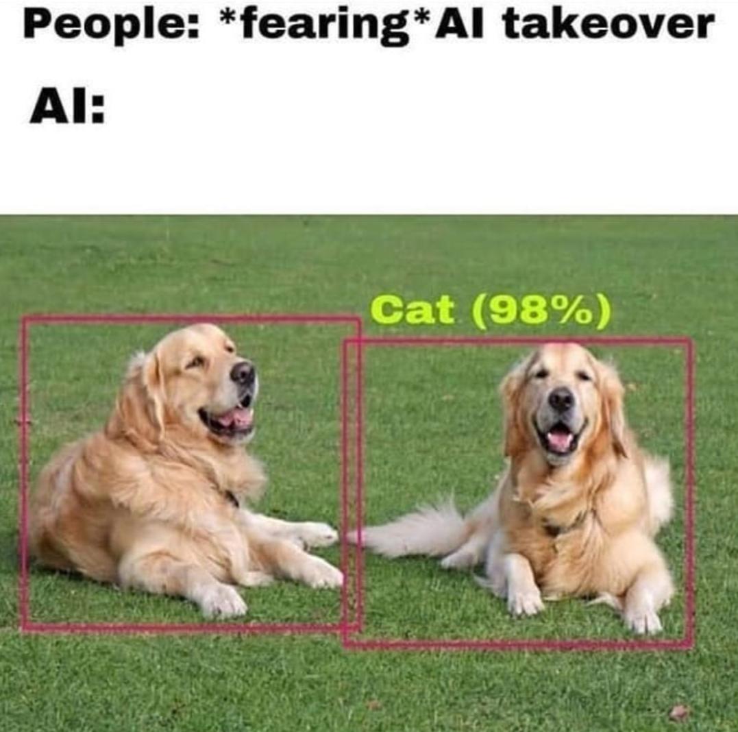
Figure: Meme about the overconfidence of an AI agent (obviously uncalibrated) over a failed prediction.
Calibration is a metric to quantify uncertainty, measuring the difference between a model’s confidence in its predictions and the actual probability of those predictions being correct.6
In other words, if a calibrated model predicts the image as a cat with a confidence of 0.3, this prediction has a 30% chance of being correct. The actual aim is not exactly to explain the results, but confidence calibration prevents some mistakes by associating a prediction with its confidence score.
Let’s explore further the motivations of calibration and the way to measure it and the potential draw backs.
2.1. Importance of calibration
The gap in confidence calibration has been spotted by [Guo et al. (2017)]5, and is linked to the actual use cases of neural networks, where the calibration is not crucial. In LLMs or online recommender systems, a 90% quality of predictions is enough and occasional mistakes are acceptable. For further use however, like in medical diagnosis prediction or in defense systems, an overconfident model can lead to tragic consequences.
What would be the benefits of a well calibrated model ?
- It can filter out the poor predictions, and not provide a wrong prediction to the user.
- It can reinforce the continuous training, by asking for the actual label of the low confidence prediction.
- It can detect outliers and warn the user that something strange is happening.
- It can improve the robustness of the model by ensuring that prediction confidence accurately reflects the underlying uncertainty, leading to more reliable decisions in critical situations.
To sum it up, a well calibrated model is a reliable coworker aware of its own capacities.
2.2. Calibration Metrics
To compare the calibration of models, specific metrics are required. Unlike simple accuracy on a dataset, various metrics have been proposed in the literature, each focusing on different characteristics.
2.2.1. The Brier Score
The Brier score [Brier, 1050] is the mean square error between predicted confidence and target. Here the target has the form of a one-hot encoded vector.
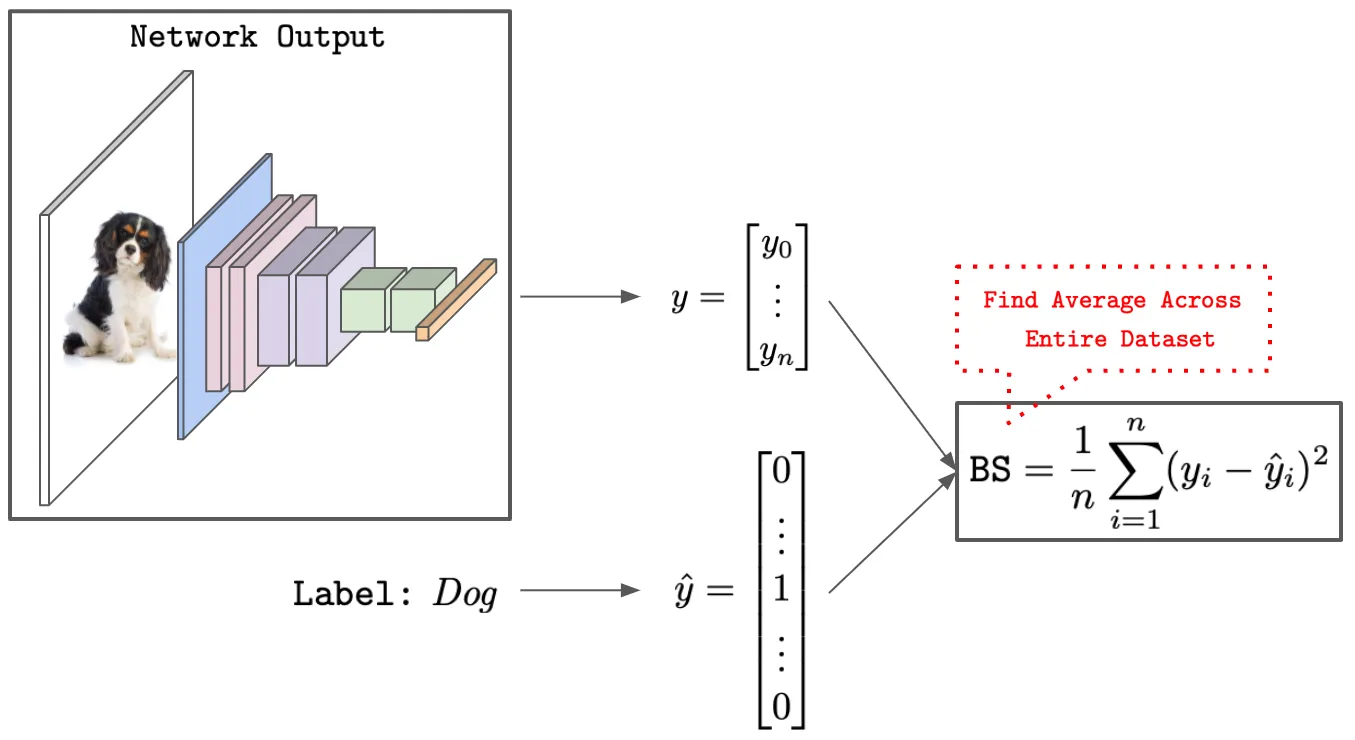
Figure: Computing the Brier Score on classification task (image by Wolfe)7.
Intuitively, the Brier Score measures the accuracy of predicted probabilities. It can be decomposed into three components — uncertainty (marginal uncertainty over labels), resolution (deviations of individual predictions against the marginal), and reliability (average violation of true label frequencies)
Brier Score = uncertainty - resolution + reliability
The Brier Score is insensitive to the low frequencies events, hence it can be used in combination with one of the other following metrics to provide useful insights. Basically, the score is low when the predictions reflect the confidence, i.e. when the model is calibrated.
The following code is a dummy example of Brier score computation of a single classification probabilities over 3 classes. The same probabilities will be used on different metrics.
import torch
from sklearn.metrics import brier_score_loss

# Example of prediction outputs
prob_u = torch.Tensor([0.34, 0.33, 0.33])
prob_l = torch.Tensor([0.5, 0.25, 0.25])
prob_h = torch.Tensor([0.9, 0.07, 0.03])
target = torch.Tensor([1, 0, 0])
# Compute brier score
print(f"Brier score for uniform:\t {brier_score_loss(target, prob_u):.4f}")
print(f"Brier score for low confidence:\t {brier_score(target, prob_l):.4f}")
print(f"Brier score for high confidence: {brier_score(target, prob_h):.4f}")
Output
Brier score for uniform:	      	0.2178
Brier score for low confidence:		0.1250
Brier score for high confidence:	0.0053
2.2.2. The Expected Calibration Error (ECE)
The Expected Calibration Error [Guo et al, 2017] approximates the difference between accuracy and confidence by grouping samples into equally spaced bins with respect to their confidence scores. Because it is both simple and interpretable, ECE is a popular metric to evaluate calibration on classification tasks in practice. ECE computes the difference between average confidence and accuracy within each bin, then takes a weighted average of these values based upon the relative size of each bin.
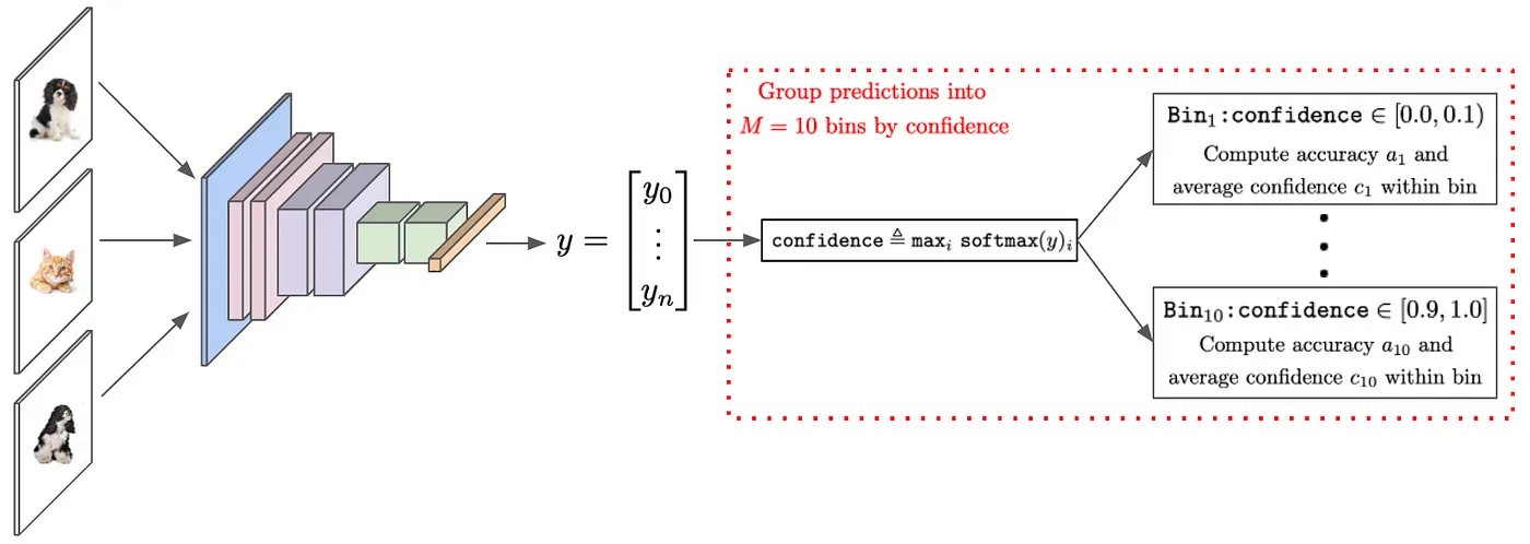
Figure: Computing ECE over a group of prediction, (image by Wolfe)7.
ECE measures how well a model’s estimated “probabilities” match the observed probabilities by taking a weighted average over the absolute difference between accuracy and estimated probabilities (confidence). This measure involves splitting the predictions into $M$ equally spaced bins.
$$ECE = \sum_{bins}^M \frac{\text{bin size}}{\text{nb samples}} | \text{accuracy per bin} - \text{average bin probability}| $$
A very good example on how to compute ECE by hand can be found in the article of Maja Pavlovic on the blog TowardsDataScience8.
Variants: Adaptative ECE (AECE) is simmilar to ECE, but with each bin having the same number of samples. Other extensions of ECE can be used to estimate the variance over the bins, the Uncertainty Calibration Error (UCE) or the Expected Normalize Calibration Error (ENCE). They will not be detailed further here.
2.2.3. The Negative Log Likelihood (NLL)
The Negative Log Likelihood (NLL) is the typical objective function for training neural networks in multi-class classification. It characterizes the disparity between the predicted and the actual confidence for the true label. It reaches a perfect score of $0$ when all data is correctly predicted with 100% confidence, and rises as soon as some are misclassified. Hence lower scores correspond to better calibration.
Dummy example of NLL computation of a single prediction over 3 classes
import torch
import torch.nn as nn

log_softmax = nn.LogSoftmax(dim=1)
loss_fn = nn.NLLLoss()
# input to NLLLoss is of size (batch_size x nb_classes) = 1 x 3
target = torch.Tensor([0]).long()  # correct class is at index O
# different examples of logits from a classifier
logits_u = torch.Tensor([[1, 1, 1]])      # uniform prediction
logits_l = torch.Tensor([[1, 0.2, 0.1]])  # low confidence prediction
logits_h = torch.Tensor([[10, 0.1, 0.1]]) # high confidence prediction

print(f"nll uniform: \t\t{loss_fn(log_softmax(logits_u), target):.4f}")
print(f"nll low confidence: \t{loss_fn(log_softmax(logits_l), target):.4f}")
print(f"nll high confidence: \t{loss_fn(log_softmax(logits_h), target):.4f}")
Output
nll uniform: 		  1.0986
nll low confidence:   0.6184
nll high confidence:  0.0001
However, NNL also causes overconfidence in modern neural networks. They are purposely trained to minimize it by making high confidence predictions, which actually lowers the exponential sum of the soft max, as in our high_confidence example above.
This kind of behavior can be exhibited by drawing the calibration curve of the predictor.
2.3. Calibration Curves - Reliability diagrams
The calibration curves [Wilks, 1995] compare how well the probabilistic predictions of a
binary classifier are calibrated. It shows the frequency of the predicted label against the
predicted probability. It is easily drawn with the method model.predict_proba() of scikit-learn.
Scikit-Learn’s documentation provides a very insightful illustration to better understand these curves. They have fitted 4 different classifiers on a very small training set and plot the calibration curve along with the histogram showing the related distribution of the predicted probabilities on each of the 10 bins. On this specific example, we can observe the following behaviors:
- Logistic Regression: not perfect, but well calibrated because the optimized log loss is also the scoring rule (as seen in previous section).
- Gaussian Naive Bayes: its tendency to push probabilities to 0 or 1 is well shown on histogram orange. This means an overconfident model.
- Support vector Classifier displays a typical sigmoid calibration curve. This under-confident result is typical of maximum-margin methods.
- Random Forest averages the predictions over a set of models, meaning exact predictions of 0 or 1 are rare, hence the shift towards 0.2 and 0.9. The whole model seems under-confident, but since each tree is fitted in minimizing a scoring rule (Brier score of log-loss) the pink calibration curve is pretty close to the dot line.
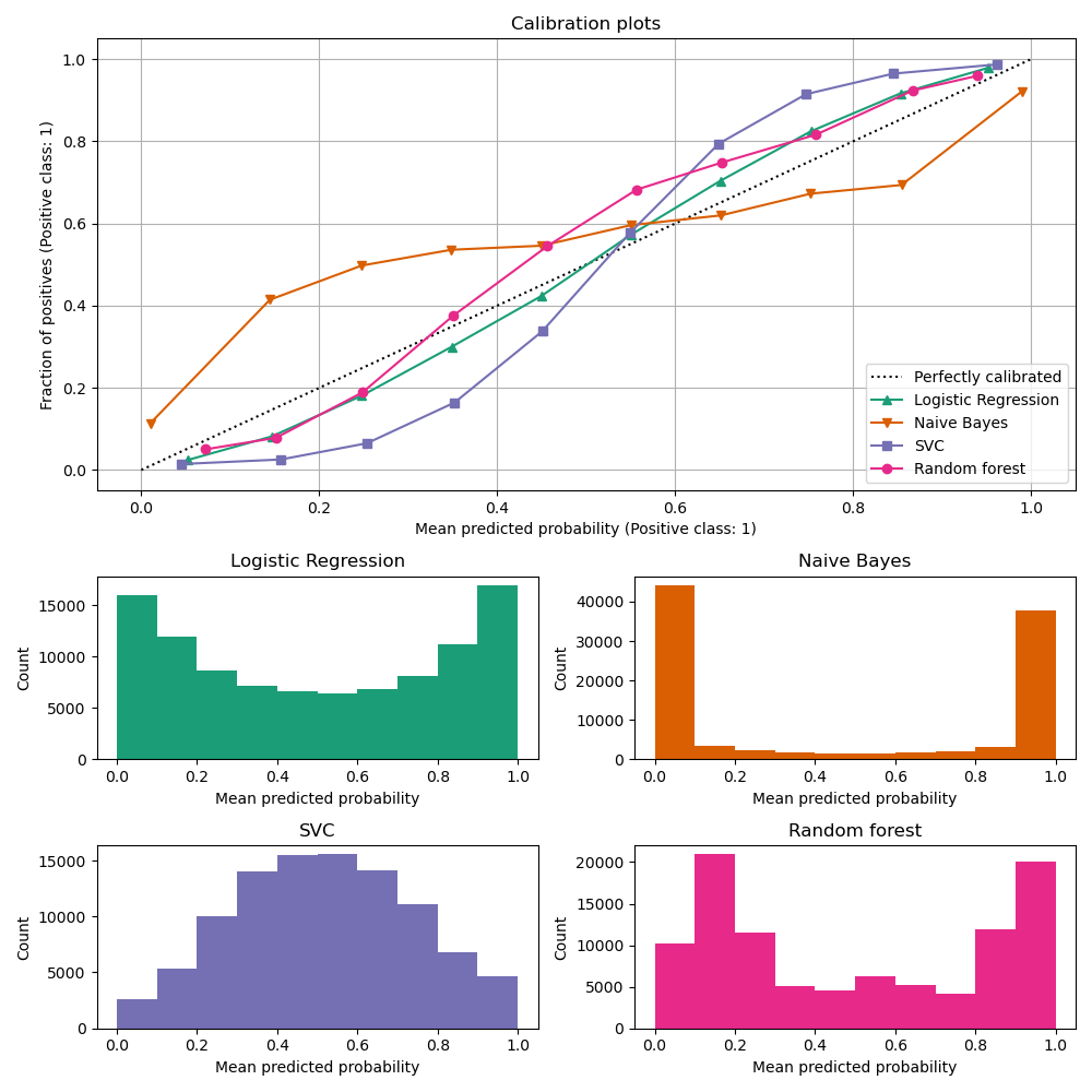
Figure: Behavior of regular classifier on a standard task.
Upper: Calibration curves with sklearn.calibration.CalibrationDisplay.from_estimator.
Bottom: Histograms of the number of samples per bins of predict_proba values.
Remember: a perfectly calibrated estimator will get the doted diagonal line and its histogram will be flat.
2.4 Drawbacks
To provide an insight of the side effects of the calibration, we will study the
impact of the provided method CalibratedClassifierCV in Scikit-Learn.
It uses cross-validation to obtain unbiased predictions, which are then used for calibration.
The sigmoid method here is a simple logistic regression model. We experiment
the effect of the calibration on the accuracy and the Brier Score of 4 classifiers
fitted on the titanic dataset. We will only display the code to instantiate and
calibrate the models.
from sklearn.linear_model import LogisticRegression
from sklearn.naive_bayes import GaussianNB
from sklearn.svm import SVC
from sklearn.ensemble import RandomForestClassifier
from sklearn.calibration import CalibratedClassifierCV

# [...] load titanic dataset, split data, Skub automatically the data
X_train, X_test, y_train, y_test = train_test_split(...)

# Initialize classifiers
classifiers = {
    "Logistic Regression": LogisticRegression(),
    "Naive Bayes": GaussianNB(),
    "Support Vector Classifier": SVC(probability=True),
    "Random Forest": RandomForestClassifier(),
}
# Calibrate with the simgmoid regression
calibrated_classifiers = {}
calibrated_proba = {}
for name, classifier in classifiers.items():
    calibrated_classifiers[name] = CalibratedClassifierCV(
        classifier, cv=3, method="sigmoid"
    ).fit(X_train, y_train)
    calibrated_proba[name] = classifier.predict_proba(X_test)[:, 1]

# [...] Compute metrics and display as bar plots
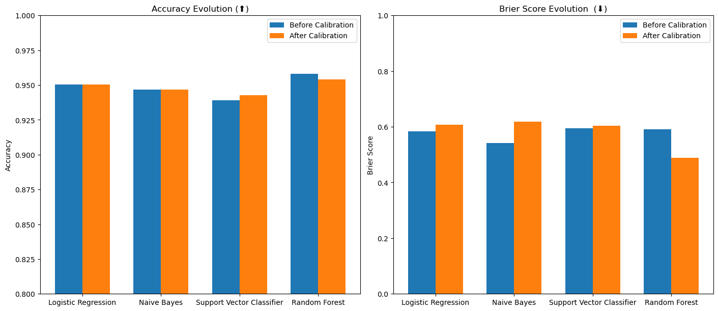
Figure: effect of calibration on classifiers’ metrics. We expect a small drop in accuracy and a reduction (improvement) of the Brier Score. But our method is not efficient here.
We can see that this method has moderate and sometimes counterintuitive effects. This suggests that the training set is not sufficient to fit a calibrated estimator.
3. Best of Both Worlds: Tailoring Mixup to Data for Calibration
We have reached the core of the paper of Bouniot et al. They show that, by taking the distance of points into account when sampling the coefficients in the second phase of Mixup, we can (i) avoid a loss in diversity, and (ii) reduce manifold intrusion and label noise.
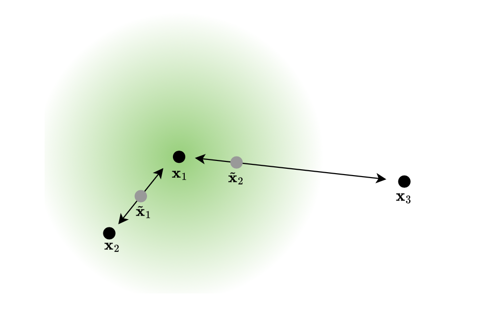
Figure: Illustration of a Blouniot et al.’s process of similarity in interpolation. New point $\tilde{\mathrm{x}}_2$ have to be closer to $\mathrm{x}_1$ because $\mathrm{x}_3$ has a different label but still preserve diversity.
If we had only used a selection of samples with similar labels, we would have lost the possible exploration of new directions of the latent space. With this similarity process, at the end of the day, we have avoided restricting possible direction of mixing while staying in the vicinity of original points, hence preventing manifold intrusion.
3.1 Linear interpolation of training samples: Mixup
Mixing samples through linear interpolation is the easiest and most efficient way to create new data from a computational point of view. Combining data from the same batch also avoids additional sampling during training.
Specific techniques have been proposed since 2018 to compute linear interpolation but often at the cost of more complex training or loss of diversity. The selection process of samples to interpolate from may be computationally expensive. Furthermore such studies have been conducted with the aim of improving models’ generalization, not their calibration, and will not solve our issue.
In the original mixup method of [Zhang et al. 2018]4, at each training iteration of the model, each input is mixed with another input randomly selected from the same batch, with a random strength drawn form a Beta law.
But how can we be sure of the label of these new datapoints?
3.2 Weighting to prevent manifold intrusion
The real danger of mixup is manifold intrusion, where the interpolated sample between two identical label points falls into an other class.
The likelihood of conflict in the synthetic label increases with the distance between the two points. As data live in manifolds of the representation space, the linear combination of two points far from each other can lie in a different manifold than the linear combination of the labels. The further away the points are, the more manifolds can exist in between.
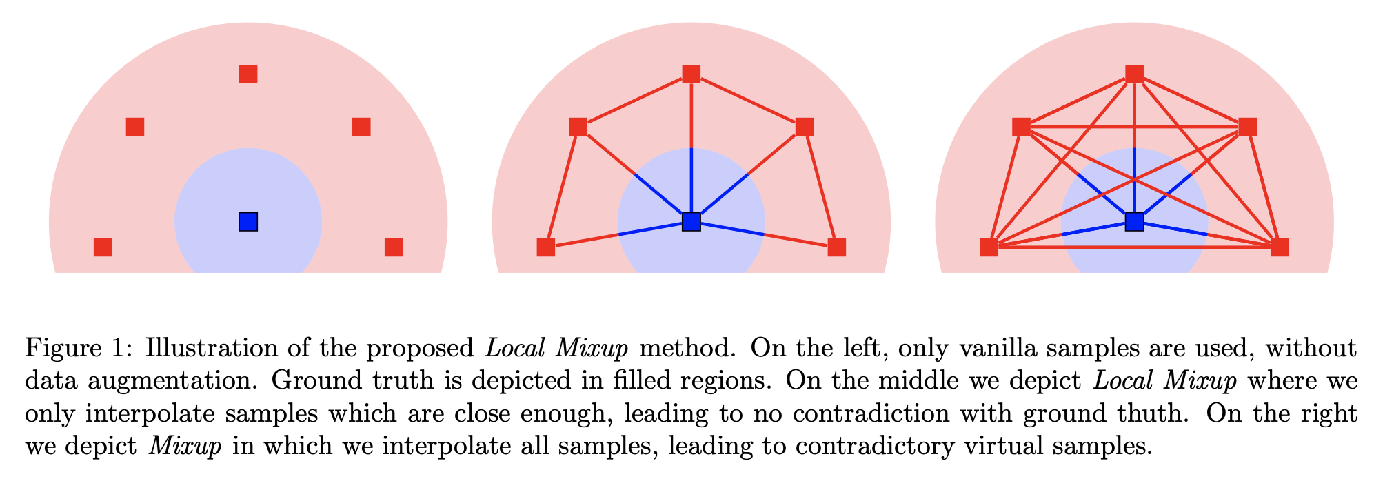
Figure: Illustration from [Baena, 2022]9 of a manifold intrusion (right) when drawing samples as mixup existing points. The linear interpolation (red line) crosses the blue classe leading to conflict.
Bouniot et al. have conduct extensive experiments to show that there is a trade-off between adding diversity by increasing the proportion of elements to mix, and uncertainty by mixing elements far from each other. Furthermore, it shows that we cannot restrict pairs to mix by selecting data solely based on distance, as it can degrade performance by reducing diversity of synthetic samples.
To better control this trade-off with Mixup, they suggest to tailor interpolation coefficients based on the distance of training data. The final part will detail this process.
3.3 The power of the similarity kernel
Bouniot et al. used a similarity kernel to mix more strongly similar data and avoid mixing less similar ones, to preserve label quality and confidence of the network.
To do so, they needed to change the interpolation coefficient depending on the similarity between the points. They have found a way to preserve the type of distribution of samples by warping these coefficients at every iteration to govern the strength and direction of the mixup. Curious readers can refer to section 3.2 of 6 for technical details. In summary, they only need the parameter $\tau$ of a Beta distribution $B(\tau, \tau)$ that behaves logarithmically with this parameter. Hence, $\tau$ should be exponentially correlated with the distance of points to finally obtain a linear interpolation.
To this end, they define a class of similarity kernels, based on a normalized and centered Gaussian kernel, that outputs the correct warping parameter $\tau$ for the given pair of points. This similarity kernel is defined by the amplitude and the standard derivation of the Gaussian, two additional parameters to tune separately. The computation of $\tau$ also depends on the average distance of samples in the same batch. More specifically, for classification tasks, they use the $L_2$ distance between embeddings, while for regression tasks, they use the distance between labels.
The algorithm to compute this parameter is described bellow in pseudo-code:
Input: (Batch (x_i, y_i) of size n, kernel similarity parameters, current model parameters)
Sample random permutation sigma
For i in [1, n], do
  # Compute the interpolated points from x_i and x_sigma(i):
  Compute warping parameter tau using a Beta coefficient and the similarity kernel
  Generate new point x_tilde as a linear interpolation of x_i and x_sigma(i), weighted by tau
  Generate new label y_tilde as a linear interpolation of y_i and y_sigma(i), weighted by tau
  Aggregate new data to batch
Optimize loss over this augmented batch
Output: the updated model parameters
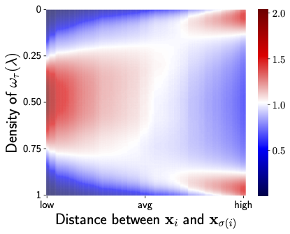
Figure: Illustration of the effect of the similarity kernel on two points $x_i$ and $x_{\sigma{(i)}}$, additional description bellow. Figure from [Bouniot, 2024]6.
The motivation behind this kernel is to have $\tau >1$ when the two points to mix are similar, i.e., the distance is lower than average, to increase the mixing effect, and $\tau < 1$ otherwise, to reduce the mixing. Above Figure illustrates the evolution of the density of warped interpolation coefficients $ω_τ(λ)$, depending on the distance between the points to mix. Close distances (left part of the heatmap) induce strong interpolations, while far distances (right part of the heatmap) reduce interpolation. Using this similarity kernel to find the correct τ to parameterize the Beta distribution defines our full Similarity Kernel Mixup framework.
3.4 Going further
Extensive experiments have been conducted by the authors on image classification and regression tasks. They have reproduced the protocol of the literature and their framework displays an improvement in both accuracy and calibration across the 3 metrics described above (ECE, Brier and NLL).
It is important to note, however, that the hyper-parameters have been tuned, and the best results across different metrics do not share the same values for the kernel standard deviation.
During the experiment process, the authors have compared the final results after temperature scaling, following [Guo, 2017]5 process. This temperature is also a learnable parameter that have been optimized during the training of the models.
In addition to improving calibration and performance, this approach demonstrates greater frugality by reducing computational overhead compared to other calibration-driven data augmentation methods. By efficiently tailoring the interpolation process, it lowers the number of unnecessary computations and memory usage, contributing to more sustainable and energy-efficient machine learning practices.
Conclusion
With similarity kernel, we get a more accurate and better calibrated model because the coefficients governing the interpolation are warped to change their underlying distribution depending on the similarity between the points to mix, so that similar datapoints are mixed more strongly than less similar ones, preserving calibration by avoiding manifold intrusion and label noise.
As seen in the pseudo-code, this provides a more efficient data augmentation approach than Calibration-driven Mixup methods, both in terms of time and memory, offering a better trade-off between performance and calibration improvement, while promoting frugality by reducing unnecessary computational resources.
Concurrently, [Verma et al. 2018]10 have proposed the Manifold Mixup framework that encourages neural networks to predict less confidently on interpolations of hidden representation via a simple regularizer. This training method leads to class-representations with fewer directions of variance. But even with the actual purpose the reduce the over confidence, the word “Calibration” never occurs in the paper…
This highlights the necessity of raising awareness about calibration and establishing a standard process for evaluating models.
P.Y. Simard, D. Steinkraus, and J.C. Platt. Best practices for convolutional neural networks applied to visual document analysis. In Proceedings of the Seventh International Conference on Document Analysis and Recognition, volume 2, pages 958–962, 2003. ↩︎
Ekin D. Cubuk, Barret Zoph , Dandelion Mané, Vijay Vasudevan, Quoc V. Le, Google Brain (2018). AutoAugment: Learning Augmentation Strategies from Data arXiv ↩︎
Ting Chen, Simon Kornblith, Mohammad Norouzi, Geoffrey Hinton, (2020). A Simple Framework for Contrastive Learning of Visual Representations arXiv ↩︎
Zhang, H., Cisse, M., Dauphin, Y. N., and Lopez-Paz, D. (2018). mixup: Beyond empirical risk minimization. In International Conference on Learning Representations. ↩︎ ↩︎
Guo, Chuan, et al. “On calibration of modern neural networks.” International Conference on Machine Learning. PMLR, 2017. ↩︎ ↩︎ ↩︎
Bouniot, Q., Mozharovskyi P., d’Alché-Buc, F. (2023). Tailoring Mixup to Data for Calibration arXiv ↩︎ ↩︎ ↩︎
Cameron R. Wolfe, Ph.D. Confidence Calibration for Deep Networks: Why and How? medium/TowardsDataScience blogpost ↩︎ ↩︎
Maja Pavlovicic, Expected Calibration Error (ECE): A Step-by-Step Visual Explanation link ↩︎
Raphael Baena, Lucas Drumetz, Vincent Gripon (2022) Preventing Manifold Intrusion with Locality: Local Mixup arXiv ↩︎
Verma, V., Lamb, A., Beckham, C., Najafi, A., Mitliagkas, I., Lopez-Paz, D., and Bengio, Y. (2019). Manifold mixup: Better representations by interpolating hidden states. In Chaudhuri, K. and Salakhutdinov, R., editors, Proceedings of the 36th International Conference on Machine Learning, volume 97 of Proceedings of Machine Learning Research, pages 6438–6447. PMLR. ↩︎